How to Overengineer a Line Chart
May 20, 2025
I recently decided to move a line chart in one of my projects from a high-level charting library to a more custom solution using D3.js and SVG. I thought it would fix all my performance problems, and I would be able to quickly add panning and zooming while I was at it. That's not quite what happened though. Both the performance and the panning/zooming problems posed interesting challenges that took me down surprisingly interesting rabbit holes and taught me far more than I anticipated.
Let's start with panning and zooming!
The x-axis is easy: change the left and right bounds of the chart by the same amount to pan and by different amounts to zoom. The y-axis is where things get interesting, because we would like to automatically calculate the y-domain based on the x-domain. If you treat a line chart like an image and zoom both axes proportionally, you might crop out parts of the line, and if you fix the y-domain to encompass all possible y values, the chart would appear too squished at higher zooms. So, the problem becomes finding the best y-domain given the left and right bounds of the chart. But what about that is hard?
Finding the Y-Domain
If you didn't care about panning and zooming, it wouldn't be hard at all -- just take the minimum and maxiumum visible y values and add some padding:
function calculateYDomain(l: number, r: number): [number, number] {
	const yVals = getYVals(l, r);
	const [min, max] = [Math.min(...yVals), Math.max(...yVals)];
	const padding = (max - min) * 0.1;
	return [min - padding, max + padding];
}
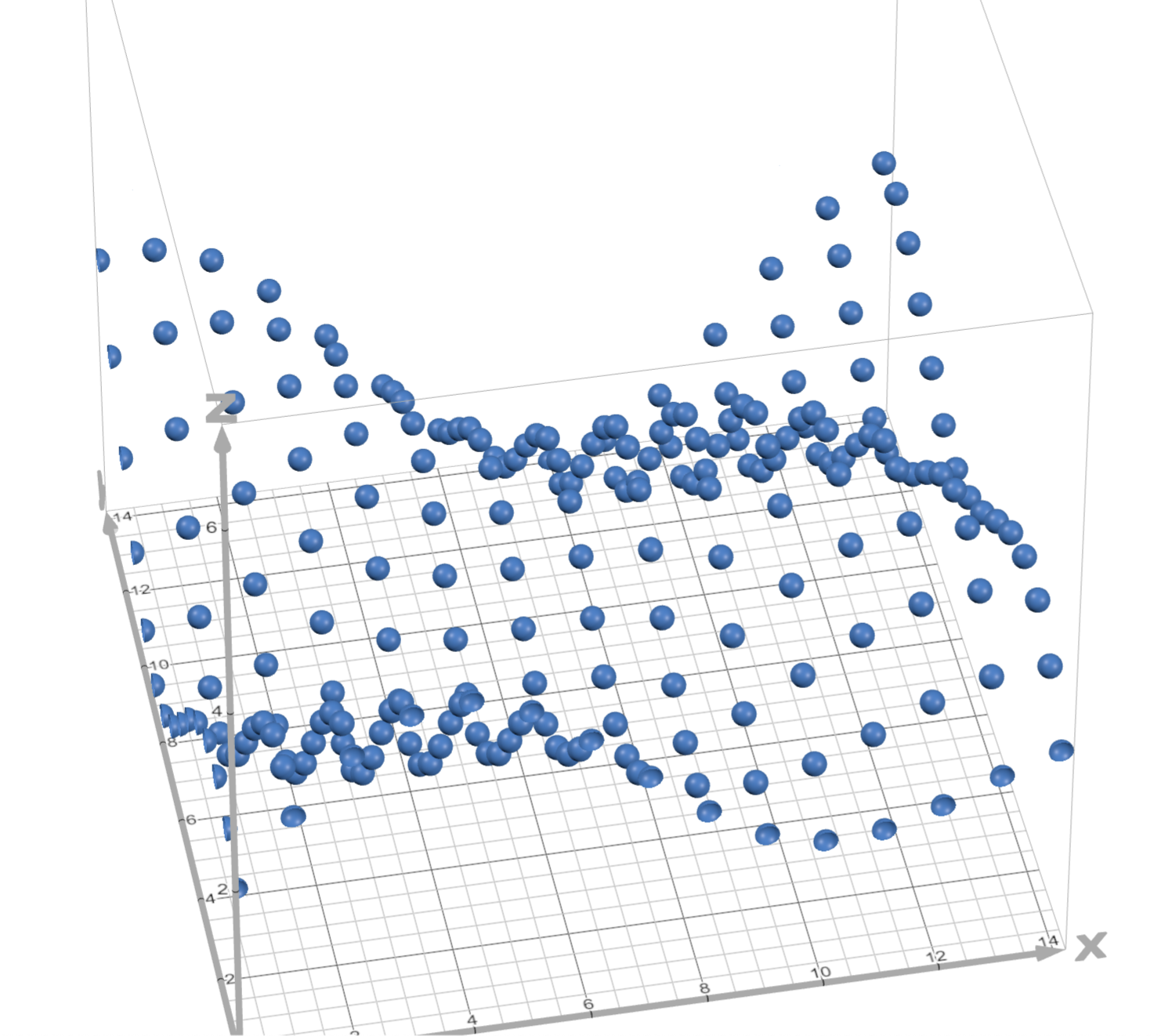
The problem arises when you try to pan or zoom, recalculating the y-domain as the bounds change. The green lines in the following image are what the 4 corners of the viewport would follow as you zoom into the center, and the red lines are what the top and bottom of the viewport would follow while panning at a zoom of 30 visible data points (the sensible default zoom for my use case).
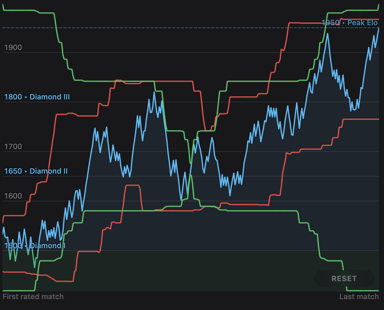
As you can imagine by looking at the lines, the above naive algorithm results in very jittery and unpleasant panning and zooming, with rapid up and down jumps. So how do we smooth things out? The first thought I had was to extend the range. That way, the range would be more likely to include more variation, and extreme up and down jumps would be harder to come by.
function calculateYDomain(l: number, r: number): [number, number] {
	const extendRangeBy = (r - l) * 0.2;
	const yVals = getYVals(l - extendRangeBy, r + extendRangeBy);
	const [min, max] = [Math.min(...yVals), Math.max(...yVals)];
	const padding = (max - min) * 0.1;
	return [min - padding, max + padding];
}
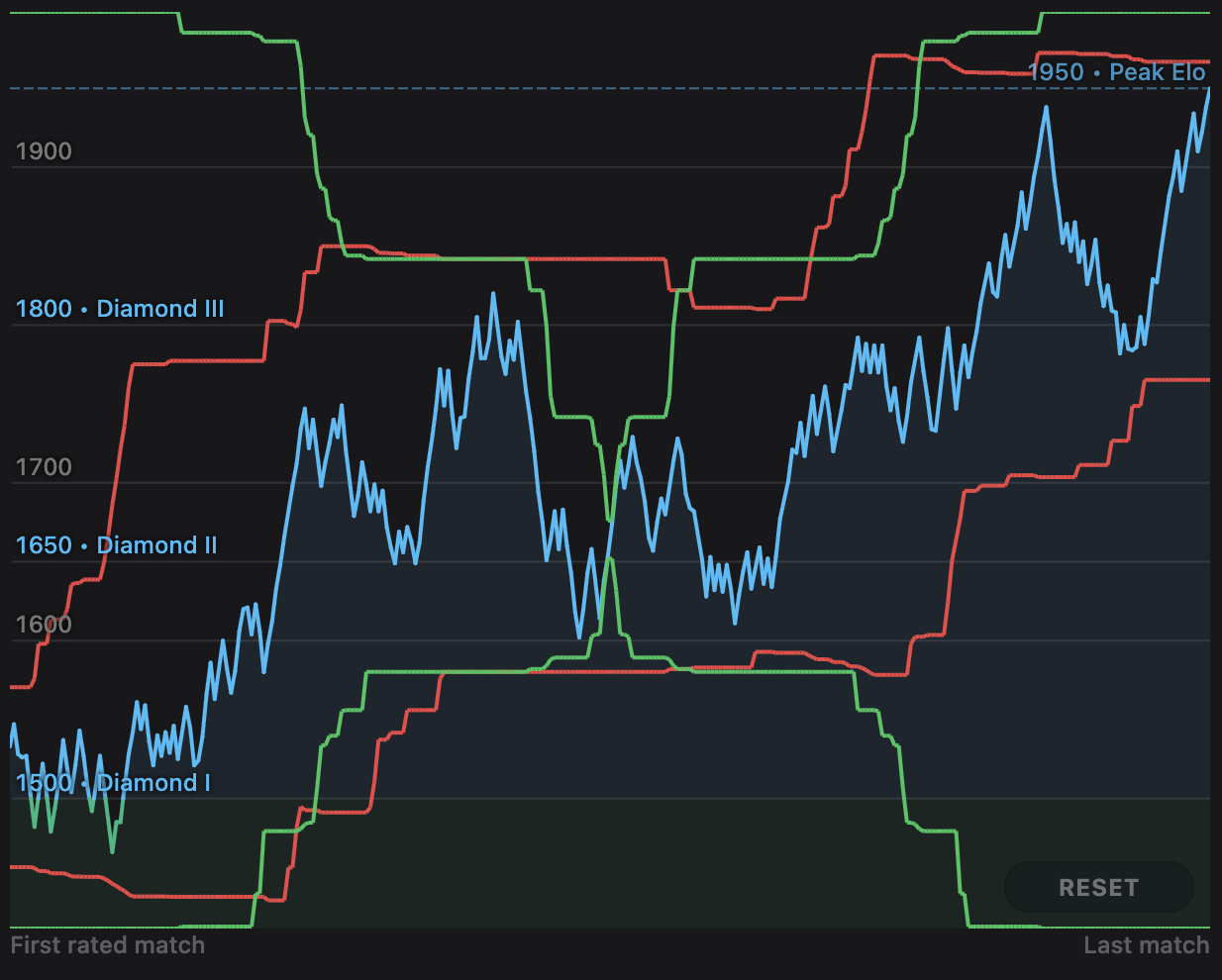
Unfortunately, this doesn't help much. There are slightly fewer rapid ups and downs (especially in panning), but the root problem of sudden jumps still remains. We would really like the y-domain to smoothly ease into an upward movement if the chart is about to go up while panning, for example. In other words, the red and green lines should be curvy, not jagged. To try to acheive this, I decided to look at the average visible y value. This has a big problem though: the average is only one number. We need two! The only way to use the average is to use it as the center of the y-domain, use some other heuristic to decide on the height of the domain (I used 4 times the width), and use the min and max values to make sure we don't crop out a part of the line:
function calculateYDomain(l: number, r: number): [number, number] {
	const yVals = getYVals(l, r);
	const [minYVal, maxYVal] = [Math.min(...yVals), Math.max(...yVals)];
	const padding = (maxYVal - minYVal) * 0.1;

	const avg = d3.mean(yVals)!;

	const targetHeight = (r - l) * 4;
	const targetLo = avg - targetHeight / 2;
	const targetHi = avg + targetHeight / 2;

	const lo = Math.min(minYVal - padding, targetLo);
	const hi = Math.max(maxYVal + padding, targetHi);

	return [lo, hi];
}
This works great for the parts that aren't bounded by the min or max, but is no better than the last 2 methods for the parts that are, which is what you'd expect. As it turns out though, it's bounded by the min and max quite often, at least for my use case. You can make this happen less often by increasing targetHeight, but it doesn't address the root problem: we need a way for the height of the y-domain to smoothly grow and shrink.
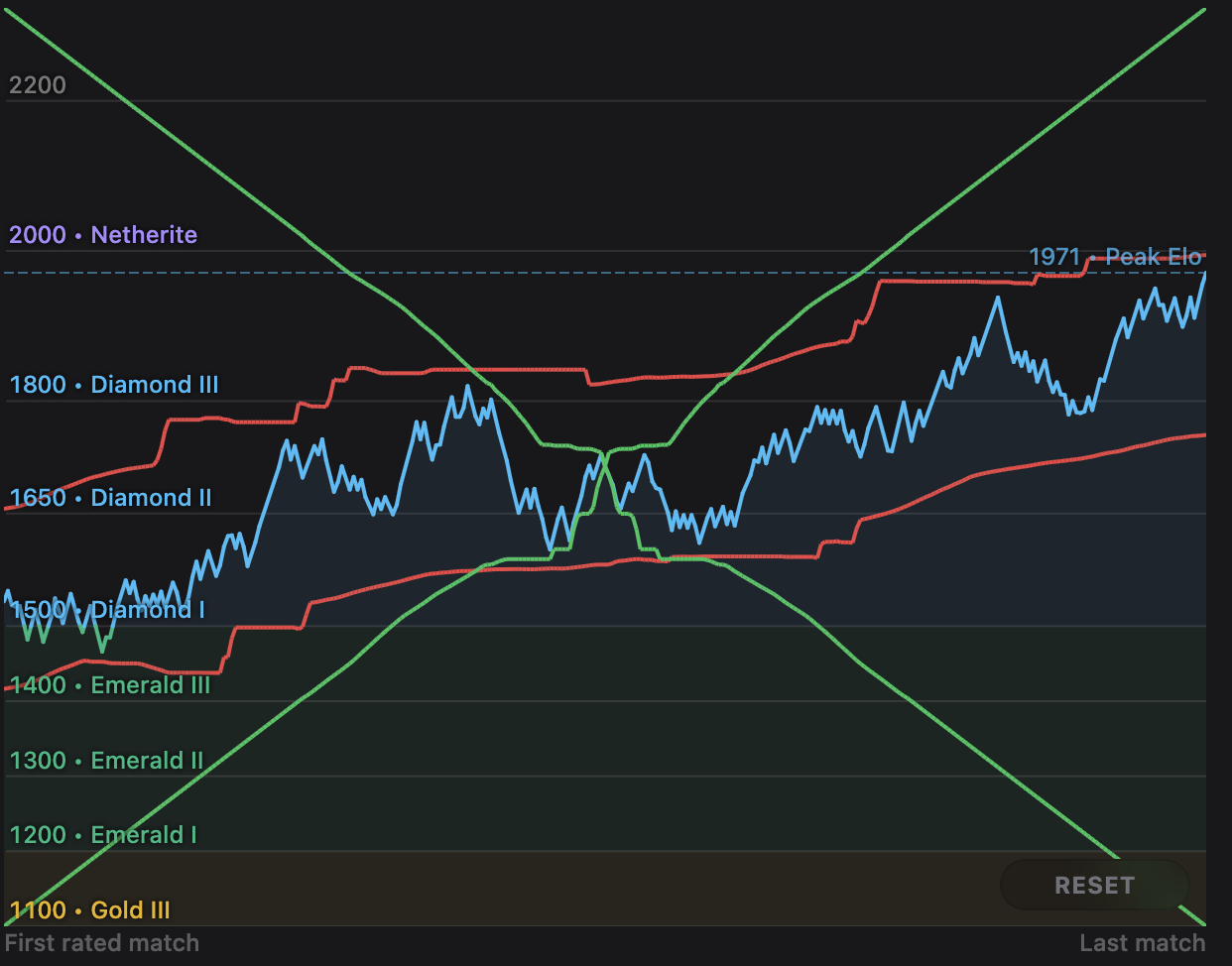
For the final iteration, I went back to calculating min and max y values, but not just once. Instead, I calculate the y domain for nearby windows independently using the naive min-max method from the beginning, and then take their average of those results. This way, the height of the window can vary, and our red and green lines will smooth out, since as you pan towards new y values, they will gradually weigh into the final lower/upper bound more and more as they enter more windows and contribute to their mins/maxes. (You do still need to guard against cropping out the line, but it occurs very rarely.)
// some edge-case handling is omitted for brevity

function calculateYDomain(l: number, r: number): [number, number] {
	const k = Math.round((r - l) / 4);

	const windows = _.range(-k, k + 1).map((i) => [l + i, r + i]);

	const domains = windows
		.map(([l, r]) => getYVals(l, r))
		.map((vals) => [Math.min(...vals), Math.max(...vals)]);

	// the visible window is at index k (in the middle)
	const [visibleMin, visibleMax] = domains[k];

	const avgMin = d3.mean(domains.map((d) => d[0]))!;
	const avgMax = d3.mean(domains.map((d) => d[1]))!;

	return [Math.min(visibleMin, lo), Math.max(visibleMax, hi)];
}
Interpolating
Now that we know how to find the y-domain given the bounds of the visible range, we're done, right?
Yes, but only if you're looking at a very zoomed out chart and squinting your eyes. The problem is, l and r are integers -- they represent the indeces of the first and last visible data points. But we would like to be able to smoothly pan and zoom between integer bounds; otherwise, panning and zooming would feel jittery, noticably jumping from one y-domain to the next (especially when you're more zoomed in).
So will we need to adapt calculateYDomain to accept floats, and recalulate it every frame? Ackshually, no! Instead, you can linearly interpolate between nearby integer bounds. For example, the y-domain for the bounds [10.35, 20.35] should be between the y-domains for [10, 20] and [11, 21]. Specifically, it should be 35% of the way from [10, 20]'s y-domain to [11, 21]'s. Except its not quite that simple -- that only handles panning into account. What about zooming? In other words, should [10.5, 20.5] be between [10, 20] and [11, 21] (panning left and right), or between [11, 20] and [10, 21] (zooming in and out)?
To wrap my head around this, I decided to visualize things geometrically. Imagine a 3D grid where the x-y plane is lying flat on the ground and the z-axis is pointing up into the air. Then we can represent every range [l, r] with the point (l, r, d), where d is the range's y-domain. (Yes, a y-domain is described by two numbers, not one, but we'll ignore that for now). Then since l and r are integers, you are left with a lattice of points of varying heights that look like they're lying on top of a smooth surface.
The surface has to be smooth because moving along its diagonals represents either panning (e.g. (13, 23) → (14, 24) → (15, 25) → etc) or zooming (e.g. (13, 23) → (12, 24) → (11, 25) → etc), which are both smooth thanks to calculateYDomain. Now, for freaks like me at least, our task becomes a lot clearer: we need to use the points to find the rest of that surface.
To do that, we can reduce the problem to finding the surface for one square of the grid square given its four corners, then we can apply that to every square in the grid and tile them. And to approach that, I started with thinking about just the edges. Take the square with corners , , , and . For any point along the left edge where , we can linearly interpolate between and . Similarly, for any point along the right edge , we interpolate between and . Then for any between 0 and 1, we can interpolate between these two interpolated edge values to get the z-value for any point in the square! This, as I later learned, is called bilinear interpolation, and looks like this: (desmos link)
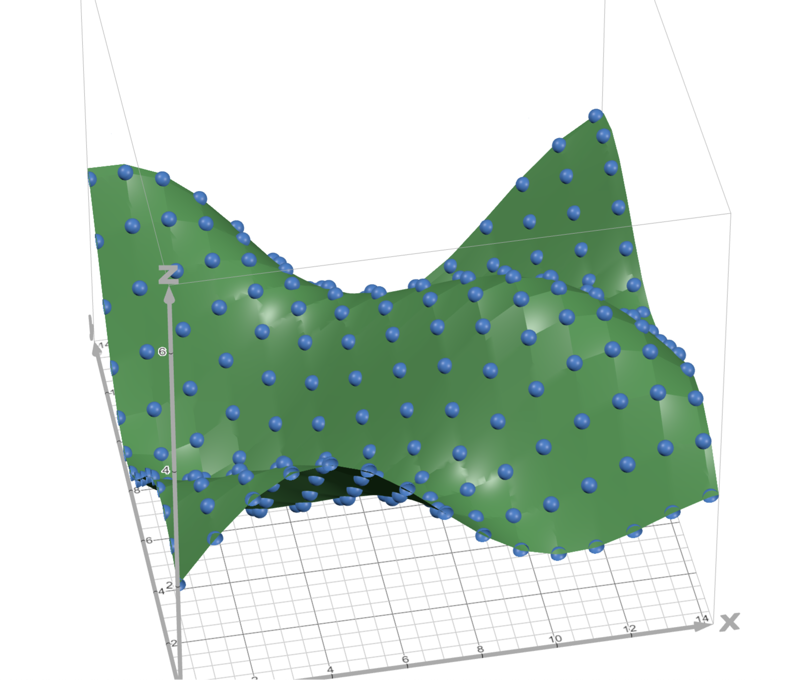
You'll notice that it's not perfectly smooth because it still uses linear interpolation (as opposed to higher-order polynomial interpolation) under the hood, but it's still surprisingly good, and was plenty good enough for my use case! And finally, since y-domains are described by 2 numbers and not one, we can simply use this method once for the lower bound and once for the upper bound to get our final domain.
Performance
As I started to test out panning and zooming, it felt smooth and looked great! But then I tried it on larger charts with thousands of points, and I felt some pretty severe lagginess. At first I thought the new calculateYDomain was too expensive, but upon using the Performance tab in the browser devtools, I found that calculateYDomain was only a small percentage of the total bottom-up time. As it turned out, the real culprit was simply the rendering of the thousands of little lines that made up the line chart. Technically, I had always had this problem and just didn't realize it, since before adding panning and zooming, I hadn't needed to redraw the chart every frame. But I did now, so I got to work trying to optimize the render performance.
The first option that came to mind was just capping the number of rendered points at a hard limit, since that's what lots of line charts do in the wild (e.g. stock charts). But I didn't really want this, mainly because users of my website were already used to the zoomed out chart retaining all the data, and partly because my data wasn't representing continuous time series data; it was actually discrete points, with roughly 5-10 points added per day per user. So, I explored another option: rendering less points, but being selective about it. Imagine a line chart with the y values . Then will be a straight line, so we can safely skip rendering the without changing the line at all. The rest of the sequence, , is not a straight line, but it's only 1 away; and if the chart were zoomed out enough, you probably wouldn't notice if the were missing. Quantitatively, we can look at how many pixels our line would get offset by if we removed some point, and if that's lower than some epsilon value (e.g. 2 pixels), we can skip the point!
To implement this idea in code, I tried a few things. I started with an solution that decreased the number of points by up to around 70% for large graphs. It worked great, except that was just too slow, and once the number of points got into the thousands, the time spent removing rendundant points was way greater than the time saved.
Next, I deferred to Google and found that this is a well-known problem -- it's called polyline simplification, and the most popular solution seems to be the Douglas–Peucker algorithm. I tried it, and indeed it seemed perfect: its average time complexity turned my function into a tiny sliver on the flamegraph, and it was removing just as many points as my solution, if not more. But it had a subtle problem: when I panned or zoomed, some parts of some lines would appear to flicker. In essence, the algorithm kept changing its mind about which points to remove based on the bounds of the visible range. And when I looked back at how Douglas–Peucker works, the reason quickly became clear:
"The algorithm recursively divides the line. Initially it is given all the points between the first and last point. It automatically marks the first and last point to be kept. It then finds the point that is farthest from the line segment with the first and last points as end points..." —Wikipedia
In other words, the first step was essentially drawing a straight line between the first and last visible points, which had a cascading effect on how the rest of the algorithm played out.
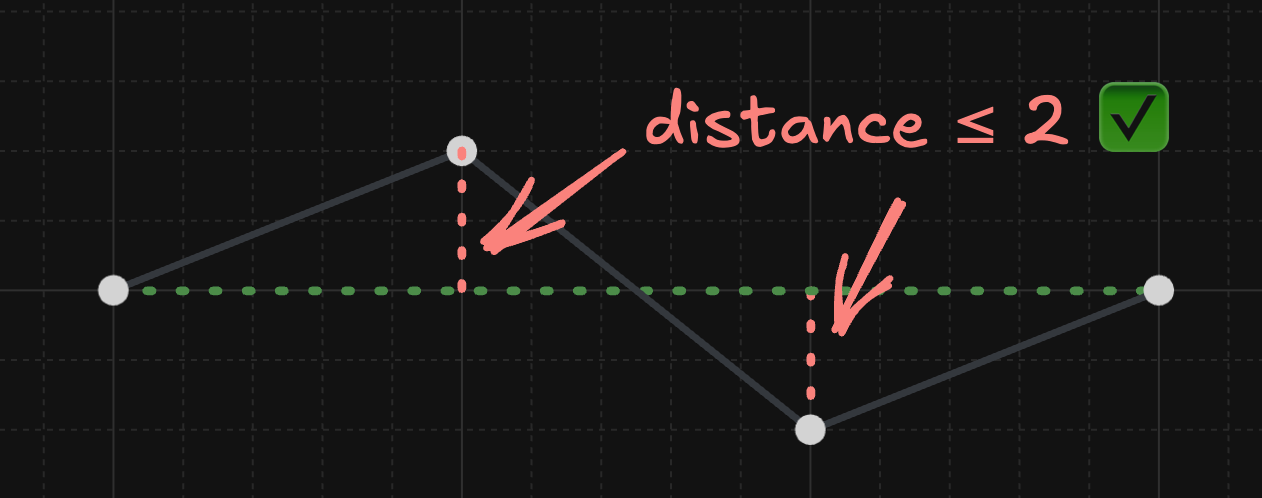
Finally, I tried a much simpler algorithm: scan left to right, look at 3 points at a time, and remove the middle point if it's close enough to the line between the other two (within epsilon pixels). The bad news is that it misses certain opportunities; for example, take the below line with an epsilon of 2.
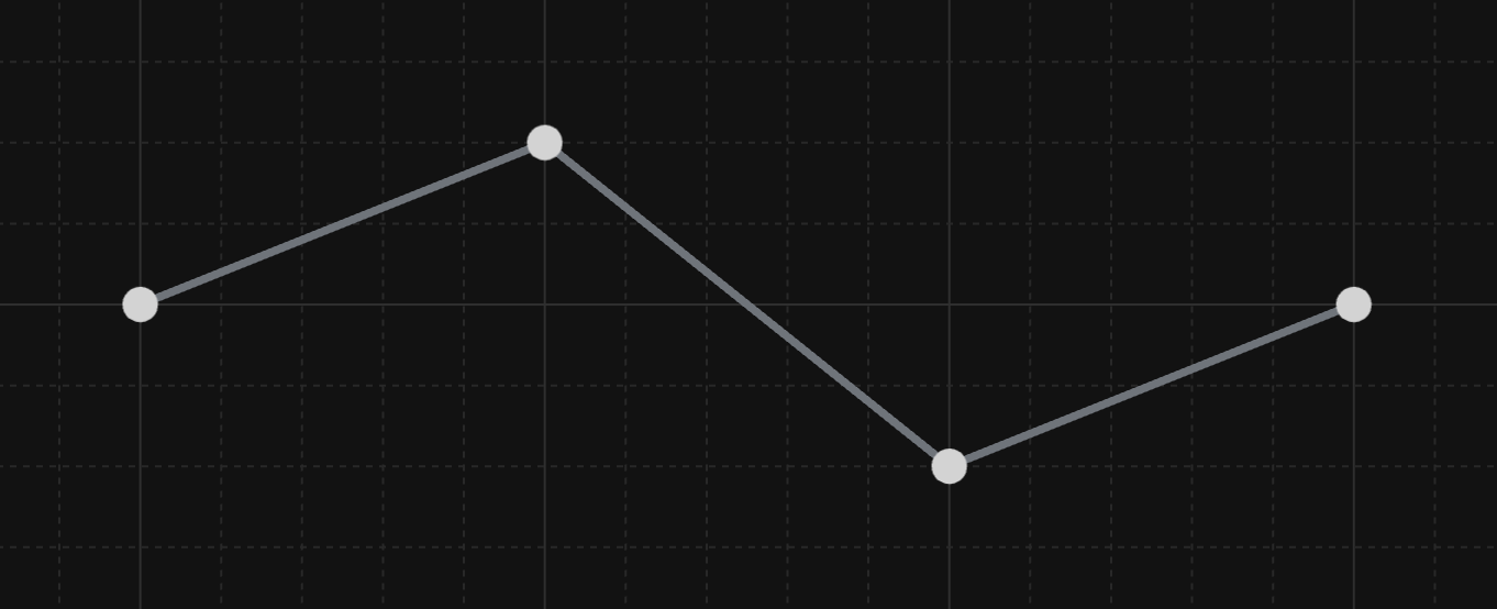
My algorithm wouldn't remove any points. It would look at the first 3 points, see that the middle point is too far, and wouldn't be able to remove it (and likewise for the last 3 points):
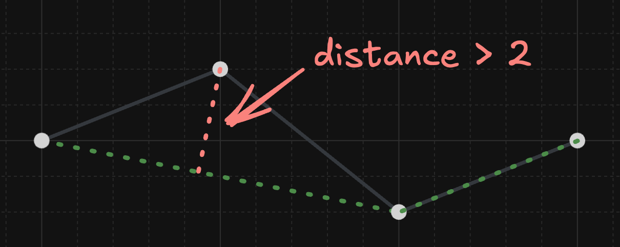
But a sufficiently smart algorithm should be able to recognize that you can (surprisingly) skip 2 points instead of 1 and end up with a better line:
There is good news though! First of all, this algorithm is , making it both the fastest and simplest yet. Secondly, the above pattern happened to be quite rare in my data for reasons I won't get into, but long story short, this algorithm still provided a 50-60% reduction in points. Lastly, it avoided flickering, aside from very small fluctuations near the start and end of the range (it still always included the first and last points, but the effect of this was miniscule and never compounded or reached the middle of the graph like it did with Douglas-Peucker). So, that was good enough for me!
Wrapping Up
I really enjoyed the process of iterating on and gradually improving solutions for both of these problems. In hindsight, I likely would have checked the todos off my todo list a little faster if I had more eagerly tried to use third-party solutions, but I don't regret doing things the hard way for a second, both for the control it gave me over the final product and the appreciation I gained for these problems and their various solutions. I view side projects not only as a way to learn new things but as a place to explore the outcome of certain decisions you wouldn't normally make, and this certainly gave me the opportunity to do both of those things!